How to Guides
Mosna proposes a pipeline to explore increasingly complex features in relation with clinical data. It can be used to extract and visualize descriptive statistics, and to identify features that are most predictive of clinical variables, by training machine learning models. In particular, the following features are explored, in order of increasing complexity:
Proportional abundance of cellular phenotypes, and proportional abundance ratios (composition)
Preferential interractions between different phenotypes, quantified with assortativity z-scores (network topology)
Cellular niches
Mosna leverages the tysserand library to discover patterns of cellular interaction that are potentially clinically relevant. In this how-to guide we discuss how to:
generate and visualize spatial networks with tysserand
calculate assortativity scores that quantify preferential interactions with mosna
generate mixing matrices with mosna
identify and visualize cellular niches with mosna (to do)
Imports and Setup
In this tutorial we assume that you have a directory containing various single-cell data files in CSV format.
We begin by importing required packages, including tysserand.
import numpy as np
import pandas as pd

from pathlib import Path

import tysserand.tysserand as ty
print(ty.__file__)

import mosna
print(mosna.__file__)
Then, we set relevant paths and load our data.
base_dir = Path("..")

mIF_path = base_dir / "raw" / "single_cell_data" # Replace single_cell_data with your directory name

csv_files = list(mIF_path.glob("*.csv"))
print(len(csv_files), "files found")

# Load all files into a dict of dataframes
dfs = {f.stem: pd.read_csv(f) for f in csv_files}
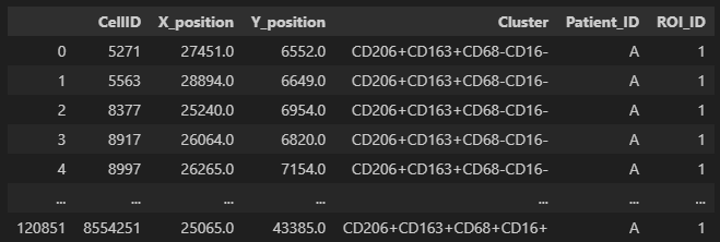
We show a single file. In the figure below we show what our input single-cell data files are expected to look like. Each row corresponds to an individual cell. Columns should include the x- and y-coordinates a cluster / phenotype assignment, and the corresponding patient and region of interest (ROI) a sample belongs to.
# Access single file, in our example file "A_01", which could correspond to patient A, ROI 01.
df_A01 = dfs["A_01"]
display(df_A01)
Generate and Visualize Spatial Networks
Tysserand generates computational networks that can subsequently be analyzed with mosna. Additionally, it provides functionality to visualize these networks. In this section, we will show how to do this. We first take a single CSV file as input. Then, we will show a function that automates this for a directory of CSV files.
To generate computational networks with tysserand, we need to provide it with the spatial coordinates of the nodes, which can either be individual cells
or spots (such as in Visium 10X genomics). The nodes should be provided as a numpy array of shape (n_nodes, 2), where the first column contains the
x-coordinates and the second column contains the y-coordinates footnote{It is also possible to provide 3D coordinates}.
Assuming we have a pandas dataframe group with columns X_position and Y_position that specify the spatial coordinates of the nodes,
we can use the following code to generate the network, using default parameters.
# We access a single file, corresponding to patient A and region of interest 01.
df_A01 = dfs["A_01"]

df_nodes = df_A01[['X_position', 'Y_position']]
df_nodes.columns = ['X_position', 'Y_position']
np_array_nodes = df_nodes.values
np_array_edges = ty.build_delaunay(np_array_nodes)
The function build_delaunay calculates the edges of the network based on the physical distance of the nodes using the Delaunay triangulation.
Adaptive Edge Trimming
Next, we will clean the network from reconstruction artifacts. In particular,
we will remove long-distance connections, which are unlikely to represent real cellular interactions.
For this purpose, tysserand performs adaptive edge trimming.
Again, we use the ty.build_delaunay(), but now we set various parameters.
pairs = ty.build_delaunay(
      coords=np_array_nodes,
      node_adaptive_trimming=True,
      n_edges=3,
      trim_dist_ratio=2,
      min_dist=0,
      trim_dist=150,
  )
node_adaptive_trimming=Trueenables the removal of edges based on distancen_edges=3ensures that each node has at least 3 connectionstrim_distdefines the maximum allowed edge length, in this case 150trim_dist_ratio=2sets distance ratio to help define which edges need to be removed
With trim_dist_ratio set to two, as in the example above, any edge with length above twice the third shortest edge are removed.
Color Mapping
Given a set of unique attributes (e.g. phenotypes) uniq, we can generate a color mapping as follows.
# In our clustermap, we want each cell to have the collor that corresponds to its assigned cell type.
uniq = df_A01["Cluster"].unique()
n_colors = len(uniq)

# Generate colormap
clusters_cmap = mosna.make_cluster_cmap(uniq)
celltypes_color_mapper = {x: clusters_cmap[i % n_colors] for i, x in enumerate(uniq)}
When visualizing the network, this color mapping will be used to give each node a color that corresponds to its attribute (e.g. phenotype)
Handling Isolated Cells
Solitary nodes can be removed as follows:
pairs = ty.link_solitaries(np_array_nodes, np_array_edges, method='delaunay', min_neighbors=3)
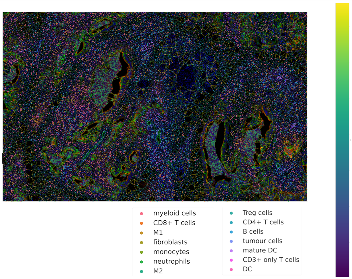
Visualization of Network
Now we are ready to plot the network using tysserand’s built-in plotting functionality:
# By calculating the distances, we can use the distance as a color-mapper.
distances = ty.distance_neighbors(np_array_nodes, np_array_edges)

ty.plot_network_distances(
      np_array_nodes,
      np_array_edges,
      distances,
      labels=df_cluster_id,
      figsize=(100,100)     # The resolution of the resulting image depends on this. Notice that (100, 100) will generate a very detailed network,
                            # but may require significant computational time for generating the network.
      legend_opt={'fontsize': 52, 'bbox_to_anchor': (0.96, 1), 'loc': 'upper left'},
      size_nodes=60,
      color_mapper=color_mapper,
      #cmap_nodes=cmap_nodes,
      #ax=ax  # Optional
  )
Putting it all Together
The steps described above, can be automated for a directory with several CSV files, using the function below.
def generate_network_plots(all_data):

  # Generate Color Map
  uniq = all_data["Cluster"].unique()
  clusters_cmap = make_cluster_cmap(uniq)
  n_colors = len(uniq)
  celltypes_color_mapper = {x: clusters_cmap[i % n_colors] for i, x in enumerate(uniq)}


  df_patient_id = all_data["Patient_ID"]
  df_ROI_id = all_data["ROI_ID"]

  grouped_df = all_data.groupby(['Patient_ID', 'ROI_ID'])

  for (patient_id, roi_id), group in tqdm(grouped_df):

      df_nodes = group[['X_position', 'Y_position']].copy()

      df_nodes.columns = ["X_position", "Y_position"]
      np_array_nodes = df_nodes.values

      pairs = ty.build_delaunay(
        coords=np_array_nodes,
        node_adaptive_trimming=True,
        n_edges=3,
        trim_dist_ratio=2,
        min_dist=0,
        trim_dist=150,
      )

      pairs = ty.link_solitaries(np_array_nodes, pairs, method='delaunay', min_neighbors=3)
      distances = ty.distance_neighbors(np_array_nodes, pairs)
      df_cluster_id = group["Cluster"]

      ty.plot_network_distances(
        np_array_nodes,
        pairs,
        distances,
        labels=df_cluster_id,
        figsize=(100,100),     # The resolution of the resulting image depends on this. Notice that (100, 100) will generate a very detailed network,
                              # but may require significant computational time for generating the network.
        legend_opt={'fontsize': 52, 'loc': 'upper left'},    #'bbox_to_anchor': (0.96, 1), 'loc': 'upper left'},
        size_nodes=60,
        color_mapper=celltypes_color_mapper,
        #cmap_nodes=cmap_nodes,
        #ax=ax  # Ensure you pass the axis here
        )

      unique_filename_network_plot = f"{patient_id}_{roi_id}_network_plot.png"

      output_path_network_plot = network_plots_path / unique_filename_network_plot

      plt.savefig(output_path_network_plot)
      plt.close()

network_plots_path.mkdir(parents=True, exist_ok=True)

all_data = df_all_phenotypes.copy()
generate_network_plots(all_data)
Data Transformation and Batch Correction
To normalize marker expression data, we can apply centered log-ratio (CLR) transformation:
obj_transfo = mosna.transform_data(
data=obj,
groups=sample_col,
use_cols=marker_cols,
method='clr')
groups=sample_colcreates groups to ensure that the transformations are applied to each sample separatelyuse_cols=marker_colsspecifies which columns contain marker expression data (as only these need to be normalized)
Visualization for Quality Control
Next, we generate a simple histogram for quality control
obj_transfo[marker_cols].hist(bins=50, figsize=(20, 20));
Network Node Transformation and aggregation
We apply the same correction to the network node data. Then we aggregate the nodes
nodes_dir = mosna.transform_nodes(
    nodes_dir=nodes_dir,
    id_level_1='patient',
    id_level_2='sample',
    use_cols=marker_cols,
    method='clr',
    save_dir='auto',
)
nodes_agg = mosna.aggregate_nodes(
    nodes_dir=nodes_dir,
    use_cols=marker_cols,
)
This combines all the nodes in the transformed network into a single data set. We can then assess and correct batch effects.
Dimensionality reduction
We create a UMAP for visual assessment of the batch effects, before correcting them.
embed_viz, _ = mosna.get_reducer(nodes_agg[marker_cols], nodes_dir)
fig, ax, color_mapper = mosna.plot_clusters(
    embed_viz,
    cluster_labels=nodes_agg['patient'],
    save_dir=None,
    return_cmap=True,
    show_id=False,
)

fig, ax, color_mapper = mosna.plot_clusters(
    embed_viz,
    cluster_labels=nodes_agg['sample'],
    save_dir=None,
    return_cmap=True,
    show_id=False,
)
Batch Effect Correction
Now we can apply the batch effect correction. In this step, the systematic differences between patients/samples are removed, while preserving the present biological variation.
nodes_dir, nodes_corr = mosna.batch_correct_nodes(
    nodes_dir=nodes_dir,
    use_cols=marker_cols,
    batch_key='patient',
    return_nodes=True,
)
Comparing Response Groups - Composition
Mosna can help identify differences in the immune landscape between the groups, through comparisons between response groups. As outlined earlier, we will compare increasingly complex characteristics (compositional differences -> assortativity -> niches) We will start by comparing compositional differences. In our example, we compare two groups: responders, and non-responders. We make use of a spatially resolved proteomic data set of Cutaneous T-Cell Lymphoma (CTCL), which was generated using CODEX technology on 70 samples from 14 different patients [1]. Of these patients, 7 responded, and 7 did not respond to treatment with anti-PD-1 immunotherapy [1].
Differential Analysis between Response Groups
First, we will investigate how compositional differences are associated to differences in response. To do so, we start by defining the response and non-response groups:
group_names = {1: "responder", 2: "non-responder"}
Next, we add attributes to nodes by creating binary indicator variables for each cell type. This enables us to filter and color network visualizations in subsequent steps.
pos_cols = ["X_position", "Y_position"]
pheno_col = "Cluster"
nodes_all = df_all_phenotypes[pos_cols + [pheno_col]].copy()
nodes_all = nodes_all.join(pd.get_dummies(df_all_phenotypes[pheno_col]))
uniq_phenotypes = nodes_all[pheno_col].unique()
Then, we use patient_col to aggregate statistics per patient and condition:
count_types = obj[[patient_col, group_col, 'Count']].join(nodes_all[pheno_col]).groupby([patient_col, group_col, pheno_col]).count().unstack()
count_types.columns = count_types.columns.droplevel()
count_types = count_types.fillna(value=0).astype(int)
Subsequently, we count cell types, and calculate the proportional cell type abundances.
total_count_types = count_types.sum().sort_values(ascending=False)
prop_types = count_types.div(count_types.sum(axis=1), axis=0)
total_prop_types = total_count_types / total_count_types.sum()
We are now ready to perform the differential analysis between response groups, using mosna’s find_DE_markers function.
pvals = mosna.find_DE_markers(prop_types, group_ref=1, group_tgt=2, group_var=group_col)
Now that we have calculated the p-values, which are corrected for the false discovery rate (FDR), we can visualize the differences between different patient groups.
fig, ax = mosna.plot_distrib_groups(
    prop_types,
    group_var=group_col,
    groups=[1, 2],
    pval_data=pvals,
    pval_col='pval',
    max_cols=-1,
    multi_ind_to_col=True,
    group_names=group_names,
    )
fig.suptitle("Cell type proportions per response group", y=1.0);
An example result is shown in the image below:
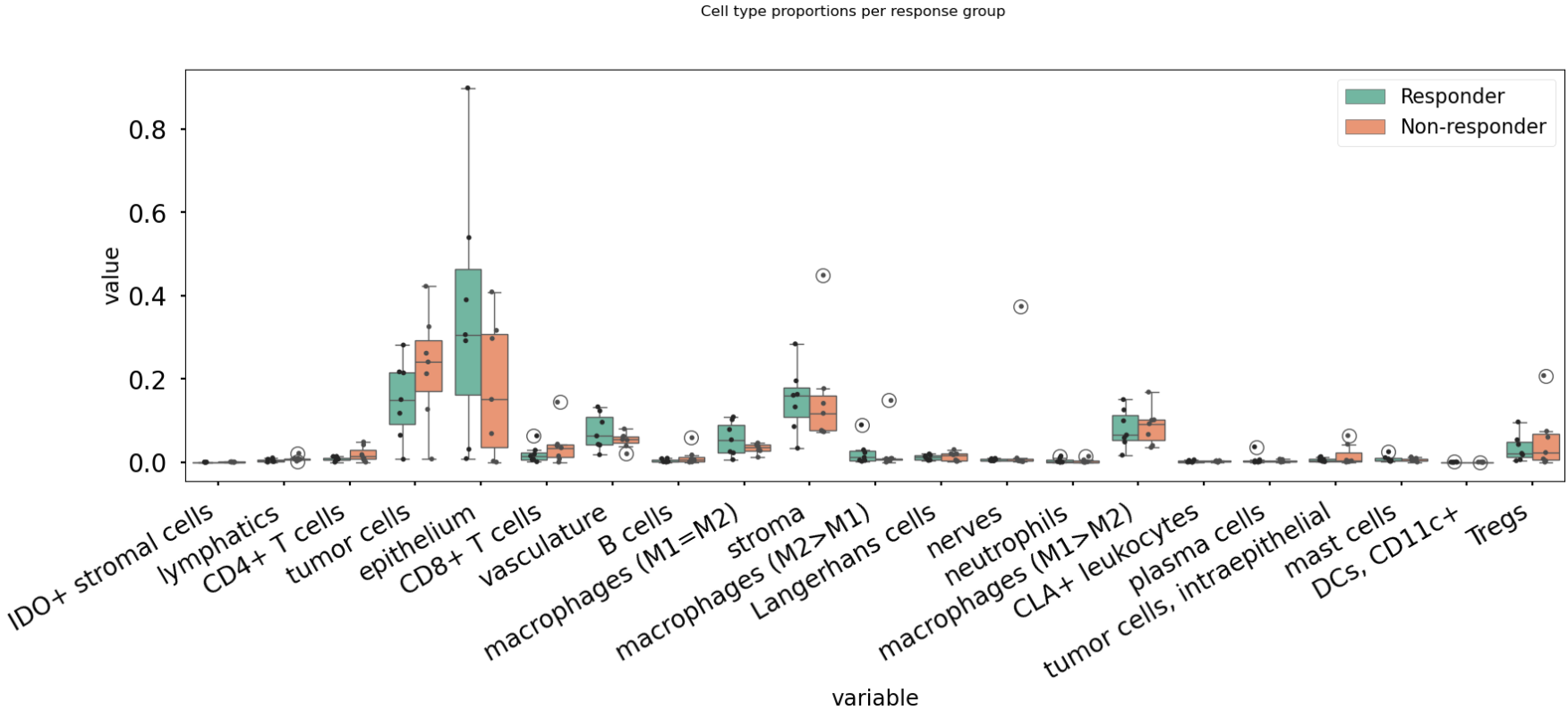
In this case, there are no significant differences in cell-type abundance between the response and non-response groups.
Proportional Abundance Ratios
Still considering composition, we will now introduce the next level of complexity: proportional abundance ratios. Two individually non-significant differences in proportional abundance between the response and non-response groups may combine into a significant shift in their ratio, especially when abundance ratios share correlated noise that cancels out.
To compare ratios of proportional abundance, we can use mosna’s make_composed_variables() function.
composed_variables = mosna.make_composed_variables(prop_types, method='ratio', order=1)
prop_types_comp = pd.concat([prop_types, composed_variables], axis=1)
pvals = mosna.find_DE_markers(prop_types_comp, group_ref=1, group_tgt=2, group_var=group_col)
We clean up the data, removing NaNs, imputing missing values:
prop_types_comp_cleaned, select_finite = mosna.clean_data(
  prop_types_comp,
  method='mixed',
  thresh=0.9,
  )
As before, we can now leverage mosna’s find_DE_markers function, now on the ratios of proportional cell type abundance.
pvals_cleaned = mosna.find_DE_markers(prop_types_comp_cleaned, group_ref=1, group_tgt=2, group_var=group_col)
Now we can again compare the groups:
fig, ax = mosna.plot_distrib_groups(
    prop_types_comp_cleaned,
    group_var=group_col,
    groups=[1, 2],
    pval_data=pvals_cleaned,
    pval_col='pval',
    max_cols=20,
    multi_ind_to_col=True,
    group_names=group_names,
    )
fig.suptitle("Ratio of cell type proportions per response group (imputed)", y=1.0);
This results in the following figure, which includes significant differences between responders/non-responders only:
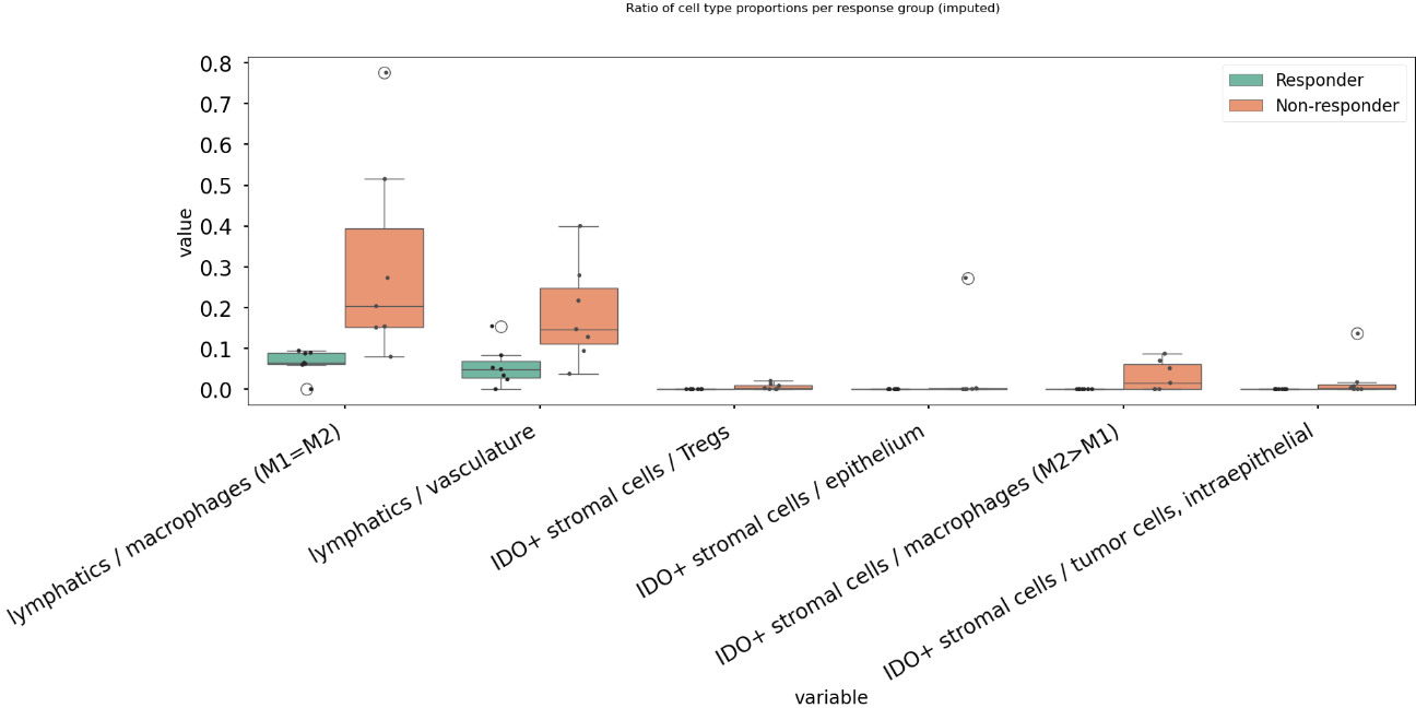
Now we find 6 significant differences in propotional abundance ratios between responders and non-responders.
Second Order Ratios
Additionally, second order ratios (i.e. the ratios of proportional abundance ratios) can be calculated using a similar approach.
Again, we use mosna’s make_composed_variables function, but now we set the order parameter to 2.
composed_variables = mosna.make_composed_variables(prop_types, method='ratio', order=2)
prop_types_comp = pd.concat([prop_types, composed_variables], axis=1)
pvals = mosna.find_DE_markers(prop_types_comp, group_ref=1, group_tgt=2, group_var=group_col)
When producing second order ratios, equivalent and inverse ratios are avoided. For example, (a/b)/(c/d) is included, but (a/c)/(b/d) not, as this would be the inverse. (a/b)/(a/d) will be excluded, as it simplifies to (d/b), which is a first order ratio.
Subsequently, the same code as before can be used to visualize differences in second order ratios between groups.
Higher order ratios are currently not incorporated.
Mixing Matrices Intermezzo - An Example
After looking at the fractional cell abundances, we move towards the next step of complexity: patterns of preferential interactions between cell-types. Assortativity analysis in mosna allows you to quantify preferential interactions between nodes with different attributes (e.g. cell types). Moreover, z-scores can be calculated to show the statistical significance of these preferential interactions. These assortativity z-scores can be ordered in a mixing matrix. Before incorporating assortativity in our comparison between response and non-response groups, we will first discuss an example of a mixing matrix, which is shown below. In this example we make use of IMC data of 7 patients, in which cellular phenotypes have been assigned as attributes to the nodes.
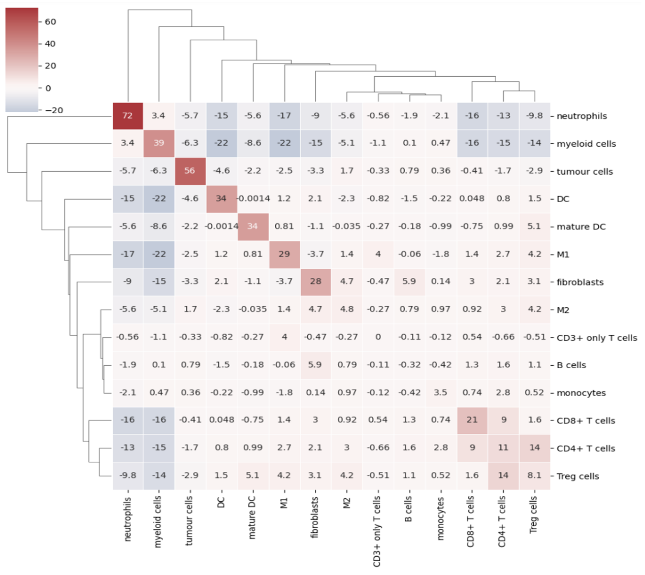
In a mixing matrix, the attributes (phenotypes) are placed on both the x- and the y-axis. Each cell in the matrix represents the assortativity z-score between the corresponding attributes. In our example above, for example, neutrophils are preferentially interacting amongst themselves (top left cell), whereas neutrophils and regulatory T-cells show avoidant behavior (bottom left cell).
To generate these mixing matrices, mosna makes use of the functions mixing_matrix() and count_edges_directed().
The mixing_matrix() function initializes the mixing matrix, and requires three main arguments:
nodes: A pandas DataFrame containing one-hot-encoded attributes for each node in the network
edges: A pandas DataFrame containing edge information with two columns named ‘source’ (node 1) and ‘target’ (node 2)
attributes: A list containing all unique attributes (e.g., cell phenotypes, cluster labels) to analyze
# Example usage of mixing_matrix function
mixmat = mosna.mixing_matrix(
    nodes=nodes_df,
    edges=edges_df,
    attributes=phenotype_list
)
Important: The edges DataFrame must contain exactly two columns named ‘source’ and ‘target’. The mixing_matrix() function uses these names internally, so they cannot be changed.
Furthermore, it is important to keep the following requirements on the input data in mind:
One-hot encoding: Node attributes must be one-hot encoded in the nodes DataFrame
Consistent indexing: The node indices in the edges DataFrame must correspond to the row indices in the nodes DataFrame
Unique attributes: The attributes list should contain all unique phenotypes or cluster labels you want to analyze
Subsequently, we can populate the mixing matrix as follows:
# For each attribute combination (i, j)
mixmat[i, j] = count_edges_undirected(
    nodes,
    edges,
    attributes=[attributes[i], attributes[j]]
)
Comparing Response Groups - Assortativity
Implementing a Cox Proportional Hazards Model
Mosna contains various functions that make it easier to implement a Cox Proportional Hazards (CPH) regression model. For background reading on CPH models, we recommend the review by [2].
In its basic form, the CPH model assumes that the hazard ratio remains constant over time. Additionally, it requires an assumption about the original form of the survival function s(t) [2]. In the CPH regression model the function is assumed to be exponention [2]. Under these assumptions, the hazard ratio of each covariate can be estimated.
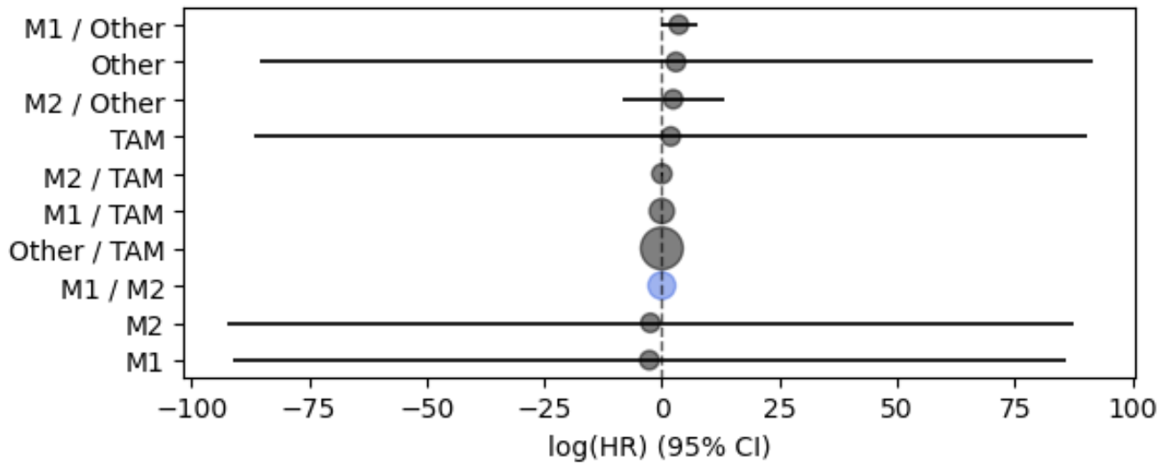
In the example below, we implement a Cox Proportional Hazards (CPH) regression model. To do so, We first obtain survival coefficients (the log transform of the Hazard ratio) with CoxPHFitter from the lifelines Python package. Then we use mosna’s plot_survival_coeffs() function to visualize the survival coefficients with their 95% confidence intervals. Additionally, we will use functions from mosna to identify the threshold that best separates survival outcomes, given a certain condition.
Using CoxPHFitter from lifelines, we obtain survival coefficients for a set of covariates. In this case the co-variates are cell proportions (e.g. TAM) and ratios of cell proportions (M1 / TAM).
from lifelines import CoxPHFitter

df_for_coxph = df_abund_prop_clin.copy()
print(df_for_coxph["duration_col"].dtype)
print(df_for_coxph["event_col"].dtype)
df_for_coxph["event_col"] = pd.to_numeric(df_for_coxph["event_col"], errors="coerce").astype(int)
print(df_for_coxph["event_col"].dtype)

df_for_coxph = df_for_coxph.dropna()
display(df_for_coxph)

cph = CoxPHFitter(penalizer=0.0001)
covariates = ["M1", "M2", "Other", "TAM", "M1 / M2", "M1 / Other", "M1 / TAM", "M2 / Other", "M2 / TAM", "Other / TAM"]
cols = ["duration_col", "event_col"] + covariates
cph.fit(df_for_coxph[cols], duration_col="duration_col", event_col="event_col")

cph.print_summary()
Now, we can use mosna’s plot_survival_coeffs function to visualize the survival coefficients, with 95% confidence intervals.
# Plot coefficients
ax = mosna.plot_survival_coeffs(
    model=cph,
    data=df_for_coxph,
    )

path_cph = output_dir / "cox_ph"
path_cph.mkdir(parents=True, exist_ok=True)
# ax.set_title(f'n sig: {n_sig} {str_params}')
figname = f"{fig_step}_CoxPH_coefficients.jpg"
plt.savefig(path_cph / figname, bbox_inches='tight', facecolor='white', dpi=600)
plt.show()
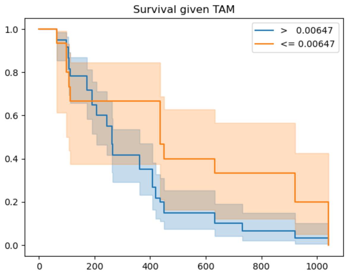
Finally, we use mosna to identify the threshold that best separates survival outcomes (or response) for a certain co-variate. In the figure below we show the resulting graph for the co-variate TAM, which is the fractional abundance of tumor associated macrophages (TAMs). Here, the ‘best-threshold’ is the concentration of TAMs at which the survival outcomes are best separated if all samples with lower TAM concentration are assigned to a group 1 and all samples with a higher TAM concentration to a group 2.
coefs_sig = ["M1", "M2", "Other", "TAM"]
km_figsize = (8, 5)

for variable_name in coefs_sig:

best_thresh, best_perc, best_p_val = mosna.find_best_survival_threshold(df_for_coxph, variable_name, "duration_col", "event_col")
print(variable_name)
print(f'best_thresh: {best_thresh:.3g}')
print(f'best_perc: {best_perc:.3g}')
print(f'best_p_val: {best_p_val:.3g}')

mosna.plot_survival_threshold(df_for_coxph, variable_name, "duration_col", "event_col", best_thresh)#, figsize=km_figsize)
figname = f"{fig_step}_survival_curves_{variable_name}.jpg"
plt.savefig(path_cph / figname, bbox_inches='tight', facecolor='white', dpi=600)
plt.show()